Monday 27 February 2012

Front cover- Final design;


Here is my completed final design of my front cover. I have added in the date and price of the issue and have created this in black font to stand out upon the green colour of her hair. I have also rotated the text to the right for it to contrast with the unrotated text on the rest of the page; I have also made this text the smallest on the page to follow conventions of a typical magazine and because I feel it holds the least importance as consumers would know where to look  if wanting to know the price of my magazine. I have positioned this text in the right corner to fill in this empty space after I had moved 'CLONED TAKING IT TO THE NEXT LEVEL'. I have repositioned the cover-lines so they all stand on the left hand of the page- I did this to gain a more organised layout and style on the cover and to also allow their to be space for another cover-line on the right hand side of the page. I have chosen to reference an article which I have presented on my contents page on my front cover- 'UPCOMING TOUR DATES 2012'. I felt that this reference within my magazine would add to my front cover by performing as a persuasive device; I have rotated it fully to the right so it appears down the right hand side of the page to contrast with the other styles of text on the page. I then took out the '//'    '.'     '-'  which I originally was going to situate around each cover-line design as I felt that it was unnecessary and appeared to busy. I then changed the font colour of my tag-line to black to compliment the black font on 'UP COMING..,' and the price and date; I felt that it contrasted with the grey font of the title design also. I kept to the same positioning of the bar code as seen in my first attempt as it filled in an empty space as if I was to put it on the other side it would of covered up the ends of her hair. 

Wednesday 15 February 2012

Front cover development;

I have created a flatplan design to act as a subtle guidelines of positioning and layout of me to shadow during the creation of the first front cover mock up;


I have decided I only want to use three cover lines and I want to spread them out on either sides of the page to gain a balanced out look of text to avoid a cluttered and busy look. I want the whole of my image to take up the whole of the page therefore avoiding the need for a background colour or border. As you  can see on the flatplan the outer lines look messy however this is the box I have created for the image to sit in which takes up the entire space therefore this is why the outer lines look messy as they have gone over the page's inner margins. However this could cause problems as I have edited my image using green/yellow tones and will need to find a colour for my cover lines to appear in which will stand out and contrast with the image. I want to follow the same structure of XXL's issue which features 'Nicki & Drake's Domination' therefore I am going to position 'Tyra's Domination' at the bottom of the page like you can see above. I have positioned the masthead and tag-line to the left of the page, creating more space on the right hand side for a cover-line to sit in.


Here is my first attempt of a mock up of my front cover having followed the same layout as the flatplan above:


 I felt that the creation of the image which I have shown in the post below, was too strong in colour, contrast and brightness, therefore I have reduced these tones on this image on my first design on Photoshop as you can see to the right. I have also stretched the image to a wider view to crop out as much of the white background as I could  as I felt that if I was going to use her as the entire background, a white background on just one side looked messy and ineffective. I have used grey and green for the text on the page as I felt that it worked with the colour scheme of the image and stood out upon it too. I have also outlined all the letters with black for the text to become a clearer read for the consumer. I have also kept to the same positioning and layout as my flatplan of the text on the page apart from the layout/positioning of the tag-line; initially I was going to rotate the tag-line slightly however when I tried this I did not feel that it looked right on the page and decided to keep it in the same theme of un-rotated text on the page. I have cropped the image to the point where you can hardly see her top; I have decided to do this to gain a larger focus on her headphones and 'Shh..'.  I have also added a bar code illustration at the bottom right of the page as I did not want to place it to the left as it would cover up parts of her hair. I have not positioned the 'HIGH TOPS' cover-line as close as I have the 'FEATURING' cover-line to the margin of the page; if I positioned the 'FEATURING' cover-line any further to the left it would be covering her cheek to much however if I am going to stick to this positioning of this cover-line in my final design I will need to move 'HIGH TOPS' cover-line to the margin more to gain an equal effect on either sides of the page. I also need to add the price of the magazine and the date of the issue and I aim to do this on my final design somewhere surrounding the masthead and tag-line.

 Below are three examples of font design I have created.  I have done this to experiment and see if I visually preferred a more interesting font for the title of my magazine in comparison to the original design displayed on my first attempt above (I have also used italic font for 'REDEFINING HIPHOP' to differentiate. 


I used a bevel and emboss effect on the first example, to allow the letters to appear more sharper, I have used an inner shadow effect on the second example to add emphasis on to the letters and allow them to appear in a darker and bolder grey and I have used a drop shadow effect on the last example for an exaggerated reflective shadow behind each letter. My preferred choice of font design is the first example as it appears as closer to my original design in terms of less effect. I do not wish to use any of three examples however I wanted to try them out to just experiment and see other styles. I want to stick to my original as I believe it appears as the most realistic as its a simple and follows conventions of Hiphop music magazines ensuring that I reach my target audience effectively. 

Photo development- Front cover;

Here is the image I am going to use on my front cover:


I shot this image using the same artist, 'Tyra' for my front cover to suggest the beginning of the USP used through-out my three creations. Firstly, from my previous research into Hiphop magazines, I became aware of a typical feature used in front cover images- they are almost always shot alongside an object of some sort; I felt that this was appealing for consumers and sometimes suggested elements of the Hiphop genre, e.g Jay Z shot with a cigar in his mouth- cigar's can be associated with gangsters associated in the Hiphop culture/scene. I was going to shoot my artist, promoting the launch of her new perfume 'Midnight' however when it came to actually shooting the image, I changed my mind and wanted to incorporate musicality instead of cosmetics to reinforce the genre of my magazine. In the end, I took an image of my artist wearing headphones; I felt that this connoted musicality as well as the Hiphop genre- when researching Hiphop magazine, The Source, one of the issue's front cover displays an image of an artist wearing headphones and I was inspired to incorporate headphones in my image due to the musical effect and Hiphop link which had been created.  I placed headphones on my artist, fitting them neatly around her neck. I positioned her hair to the side, which allowed the image to add emphasise on the headphones as you can see them more, however didn't make them look too large still keeping her big curly blonde hair still as a focus of her style and look.

After positioning the headphones around her, I then wanted to incorporate something which would foreshadow the text idea I aim to use, 'Tyra's Domination'. I decided to write 'Shh..' on her finger to support and back up this domination having been inspired by the images to the right of Hiphop artist Rihanna. (I have changed this pose which Rihanna is holding to a pose which actually reinforces the 'Shh..') The fact that the head phones are round her neck suggests that she isn't listening to anything and the use of 'Shh..' supports this silence effect further. However, through the 'Shh..' I wanted to suggest that she is telling other artists to 'Shh..' and that it is her time to dominate the industry. The direct mode of address suggests confidence and attitude which reinforces this domination even more. I directed her to pout her lips to a shape which would suggest she is actually saying 'Shh..' to make this more realistic.

I did not want to take a full body-length shot as I wanted to really emphasise the headphones and 'Shh' as I feel that it is a big part of the image and I believe that it needs to be focused on to get the intended message across to the consumer effectively. I shot the image showing almost all of her torso to display the design and style oft the top. I chose a strapless top for her to wear including colours of orange and blue with a printed pattern to suggest current fashion and sexual tones due to the no straps. I kept the bracelets she was wearing on her to suggest the artist's own sense of style and I felt that it contributed to the substance the image would lack without them. I am happy with the shot I have taken for my front cover, it suggests all the connotations which I wanted it to hold- confidence, attitude and dominance however I have a lot of editing to do on the image to eventually gain the style and look I want for my front cover.

Here is an image of the photo after I did the appropriate editing techniques to it;


I cropped the left, right and bottom of the image so it would be easier for me to fill in the background white; I also did this to gain a larger focus on her face. As she is to appear and fill in the whole entire space of my front cover, I also cropped it to gain straight edges on all four sides as the edges on my front cover will be straight too. I then filled in the background white as I do not aim to use a background colour for my front cover, I want the artist to fill the entire space so I felt that white was the safest option. After this, I increased the brightness and contrast to gain a sharpe and striking effect. When thinking of the colour scheme of the image, I had to take into consideration that the title design was yellow and grey therefore I thought a green and yellow colour tone effect through the image would be perfect; not only would it compliment the title design but also gives a 'quirky' style and appears different from all the images and colour schemes I have used in the contents page and double page spread. I then drew around the right headphone in black on Photoshop for it to stand out as much as the left one did and I also darkened her pupils for them to stand out and compliment the black in her head phones. I was thinking about going over the 'Shh..' in black too, however when I tried this it looked messy and added on therefore I have kept the original writing of it to gain a realistic tattoo effect.  

Monday 13 February 2012

Textual development- Front cover;

I want to include a tag-line next to my title design on my front cove, like the two examples below. I want my tag-line to relate to the genre of my music magazine and for it to be a catchy and appealing to differentiate my magazine to other.


Here are three tag-line ideas for my front cover;

'Hiphop at its finest'
'Redefining Hiphop'
'Hiphop taken to the next level'


 I have incorporated the genre in each three possible tag-lines as I feel that it is important to reinforce the genre to appeal to consumers. I have also created short yet catchy quotes to support the magazine in allowing it to become recognisable and remembered by previous or potential consumers. Tag-lines which typically support the title of Hiphop magazine's are normally competitive and are ones which attempt to differentiate themselves from others e.g 'Taken to the next level'  furthers what the magazine has to offer in comparrison to other magazines as it suggests that the other magazines are on a level behind; I was inspired to create this tag-line from the first example above of XXL'S magaizne tag-line.  By incorporating the term 'finest' in the first example, suggests that it is only in my magazine that Hiphop is at its best, again comparing and degrading other magazines. I have chosen to use:

'Redefining Hiphop'

I feel that the shortness of this tag-line is what makes it catchy and appealing for consumers. It brings originality to the magazine by the use of 'Redefining' which shows that the magazine is attempting to make a unique mark on the industry to show the growth of the genre and the space for individuality within it. I did not want to connote power and status in my tag-line as I have feel that I have done this through the title name 'Superior' instead I wanted to suggest originality in my magazine,
Here is a reminder of my title design of my magazine: 
SUPERIOR.

I have edited this title design from the original slightly, by adding a bold font on to the letter to emphasise the title even more. As the title design of my magazine holds a yellow block background theme through the text, I would like to upkeep this style of font in my tag-line:

Redefining Hiphop

As I am using Tyra as my main image on my front cover, I am going to be creating text to support the image and her article in the magazine. I have been inspired by the text which supports the image of the two artists in the example to the right. I admire where it has been positioned and I also am inspired by the use of the term 'DOMINATION'. I am going to use this term in the text to support the image of Tyra, however I want it to read 'TYRA'S DOMINATION'. The use of the term 'DOMINATION' supports the power connotation which foreshadows the name of my magazine 'Superior' and the style of image I have in mind to use on my front cover. 

Here is the text design I aim to use for 'TYRA'S DOMINATION':

T Y R A ' S
D O M I N A T I O N

I want to use Georgia font for the text of this, and I want to create a shadow effect of the text by moving the 'Domination' higher and closer to 'Tyra' to create this effect. I have chosen a grey font for 'Tyra' and black for 'Domination'  to allow the two to contrast whilst upholding conventions of colour schemes in the Hiphop genre. This decision may change depending on the style and colour of image I take and decisions of colour used for cover-lines.


I also want to display cover-lines to promote  'CLONED', 'HIP TOPS HITTING THE HIGH STREET' and what artists my magazine features. Below are the three cover-lines which I aim to use on my front cover:


//HIGH TOPS
SEAN HUNTER SPEAKS OUT//

.CLONED.
.TAKING IT TO THE NEXT LEVEL.


-FEATURING
50 CENT
CIARA
RIRI
NICKI MINAJ 
DRAKE
LIL WAYNE
CLONED-

Decisions on colour schemes and font of this text will have to be later during photo creation and mock up version so I can visually see what colours stand out upon the image I choose to use.


I am also going to be including the date of the issue and the price on the front cover...
NOVEMBER 2012
£2.99

Sunday 12 February 2012

Influential front covers + initial ideas;


Earlier in my blog, I deconstructed an issue of The Source and XXL's front covers and when thinking of what Hiphop music magazine's front covers inspire my initial ideas and thoughts for my own design, The Source and XXL proved to be the ones that triggered my thoughts for ideas of image, text, layout + colour scheme. Below are two examples of the music 
magazine's;


THE SOURCE: This example of the magazine's front cover inspired me most through the use the image of the artist. I admire the direct mode of address the artist is holding as it suggests confidence and dominance and I also like how close up the image has been taken to reinforce this dominance and confidence through the large focus on his face and top quarter of his body. Most of all, I admire the use of headphones which the artist is wearing; I believe this suggests musicality by reinforcing the music genre and also allows the front cover to visually look appealing for consumers. I like the different positioning of the text on the front cover also; I like how the artists name has been rotated to suggest an interesting look and style to the left of the page and I also admire the different colours used for the text as well- black red and gold to upkeep conventions within the Hiphop genre.


XXL: From this example of the front cover of one of XXL's magazines, I admire the text positioning and layout the most. I admire the positioning of the XXL to the left of the page, making room for other features on the page and I also admire how it holds a block background colour for the title to sit in; this relates to my title design as I have used this effect. I also admire the text positioning of the 'Nicki & Drake, Domination' as I believe it has been positioned clearly to still allow focus to be set on the artists themselves. I admire the simplicity of this front cover also; I like how there isn't to much text and when there is I like how it is set aside from the image drawing a complete focus on to the artists. I like the use of colours on this example, black red and white which all follow conventions of the Hiphop genre. I also admire the black background however as I have already created a black background for my contents page I am not inspired by this as I want to create a whole different style and look for my front cover.


Initial ideas;

Image: I am going to be using the same artist on my front cover which I have used for my double page spread and contents- Tyra,  to present a USP of my magazine like mentioned before. I want the image of Tyra to be the only image on the page and to be the largest feature on the page to draw a large focus to her. Currently I want her to feature as the whole background of the page however I may change this idea when it comes to shooting the image and what the result is in terms of style and positioning. If I do not place her as the whole background, I am thinking of having a grey background as I have not yet used this colour in my creations yet and feel that it is a colour which anything will show up strongly against- expanding choices of colours for text; the colour grey will also compliment the grey text used in my title design. I aim to shoot a close-up shot of my artist, like the first example, only showing her face and quarter of the top half of her body. I wish to do this to suggest dominance and confidence through the image. 

Colour scheme: I do not want to use the same colour scheme which I have used in the double page spread or contents however as my title design has been reinforced on my contents page through the presence of the 'S', I will be reinforcing the yellow also on my front cover. My title design holds a yellow block background with grey text therefore I will be using yellow again in my front cover however I will need to find a colour which either contrast or compliment the yellow apart from the black used in my contents. Depending on the editing features I apply onto the image of my artist, I will not know what colour I want to use for text and background however I know it will have to be a colour/colours which will contrast with yellow to suggest a bright + bold 'quirky' effect.

Text: I do not want to include much text on my front cover as I do not want to clutter the page or take away any importance that my artist will hold. I aim to create a cover-line promoting the image of Tyra, by using her name and another textual element to either suggest the genre of her and the magazine or something which relates back to my double page spread. I want to create cover-lines which promote artists which are to feature in my magazine like the two examples above and maybe a quote from 'CLONED' like the first example which holds a quote above the title design. I aim for the cover-lines to be smaller than the title and for the cover-line which promotes my main image of Tyra to be near enough the same size as my title design to suggest the same amount of dominance.

Layout + positioning: I aim to follow the same positioning of the title design as the second example, as I believe it eliminates any spacing problems which may arise during the creation of other features as it to the left of the page. Underneath the title design I want to position a tag-line directly underneath it but in a slightly rotated style to contrast with the positioning of the title design. I aim for the face of my main image to appear in the centre of the page like the first example and for the cover-lines  to appear around the image and to maybe even appear on top of the image depending on colour choices later. I aim for the barcode to be at the bottom of the page to follow conventions of these two examples.


Contents page- Final design;


After editing my final images appropriately, I added the images onto the mock up version I produced in the post below. I found that the images did not suit or fit around the text positioning which I designed on the mock version therefore I had to go ahead and make suitable changes to create the style and look of the contents which I wanted to achieve. I stuck to the original plan of positioning my main image of Tyra at the bottom of the page, situating her head to the right allowing her body to follow through to the left; however I did not choose to situate her more closely to the left hand side of the page. I made this decision as I wanted her legs to be positioned so they looked as if they were pushing up the 'S' and this wouldn't of been possible to do if I positioned Tyra more nearer the left margin.

I then positioned the subscription promotion feature at the bottom of the page instead of the top as due to the changes of positioning of Tyra, I felt that the bottom corner lacked in substance and I believed that the subscription feature would fulfill the space; I admired the positioning of it and thought it would be a good idea to keep it rotated to the left to upkeep the rotation theme of the 'S'. Whilst I was working at the production of the bottom of the page, I added the page number and reinforced the title name and design next to it, to upkeep this element like shown on the double page spread.

I then unrotated the features text on the right hand side of the page as I realised it did not look as I wanted it too; I felt that it looked to cluttered on the page. I also moved it slightly to the left so some of the words were displayed near her leg to upkeep the 'text situated around the image effect'. I then added my second image of my duo 'CLONED' above and inline with the features text. I added a white thick border to surround the image of 'CLONED' to contrast with the image of Tyra and to also reinforce the white colour scheme on the page contrasting with the yellow. 

Lastly, I changed my original plan of positioning and font size and style of 'Inside the issue' and 'November 2012'. I added a space between each letter of 'Inside' and used Capital Letters, to emphasise the name and importance of the page. I then used italic font for 'this issue' and displayed it in a much smaller font than 'Inside'. I created a yellow font for 'this issue' to contrast with the white font used for 'Inside'. I then placed the date in a much small font to the left of the page; I rotated it 90 degrees and took away the shadow effect I created in my first mock up- I did this because I felt it looked cluttered and not as clear as it could be for consumers. I then considered the margins of the page- inside, outside, top and bottom. I created a small margin between the bottom of the page to the image of Tyra to really gain a 'laying down' effect of her presence and lined up the page number and title design to the bottom of her arm to gain a neat and accurate effect. I left a equal and an average size of space between the text/images and the inside and outside of the page and aimed to follow the same structure of margin space at the top of the page as to the bottom to gain an equal effect. 

Thursday 9 February 2012

Contents page development;


Flatplan of contents page;


I created a flat plan of my contents page so that when it came to the first mock up design of my contents page I had more of a clearer idea of positioning of the elements on the page. 


Here is my first attempt of the creation of my contents page without images following the same structure as my flatplan;


I have stuck to my original plan of using a black background; I feel that it was the most effective colour to use which would contrast and compliment the colours which I have chosen to sit on top. I have stuck to my original plan of using a highlighted block of yellow underneath 'Features'; I felt that it worked and looked as effective as I imagined however I have changed the original grey font I was going to use for the text of 'Features' as I felt that placing it in a black font stood out and became clearer upon the yellow. I also went ahead with the same font and colour scheme for the 'S' which I wanted to appear on the contents, however I could not create it as a large as I thought to begin with as I could see that I needed to leave space for the images. I have added in the subscription feature in and I chose a yellow font for the text to upkeep the theme of the page; instead of my original plan of locating this promotion feature at the bottom of the page I decided to situate it at the top above the 'S' as I realised there would not be enough space for the image if I placed it at the bottom. I have changed the colour scheme of the date and the 'Inside' whilst also adding on 'this issue' against 'Inside'. I tried the grey font I originally wanted to use however the grey did not appear effective upon the black background- it wasn't clear and did not fit the yellow and black colour scheme. Instead I chose a white font to compliment the white font of the page references; I also created a shadow effect for 'November 2012' by creating another version of the date and placing it half way across the date above it. I chose a yellow font for the second version of the date to show this effect clearly and to also keep with the colour scheme across the page. I rotated the subscription feature, 'S' and page references 21 degrees left to create a 'quirky' style diagonally across the page. After the creation of the contents page without the images I now know that I will still go ahead with the original plan of positioning of both artists on the page; I am going to place my main original artist at the bottom of the page and my second image of the duo at the top of the page above the page references.

Monday 6 February 2012

Image development- Contents page;

I wanted to include a statement item for my artist to wear to suggest fashion, current and an 'out there look'. I was inspired by my influencial artist, Nicki Minaj from the usage of her shoes as a statement item. Below is an image of the shoes she was wearing in the images I uploaded previously; I was inspired by the colour of the shoes, the platform on them and the height. I tried to get as closest as I could by using the shoes below for my artist to wear in the image for my contents.

Here is an image of the shoes I want my original main artist, Tyra, to wear for the image on my contents page to suggest this 'out there' look and statement item effect;


Here is a photo of my original image taken of Tyra on my contents page;


As mentioned before, I wanted to create the same sort of style which is portrayed through Ciara on the VIBE contents page, therefore I went ahead and positioned my artist accordingly to gain this style. I positioned her laying down, her head on the right hand side following her body through to the left and as I wanted to position her legs on the left hand side of my contents page, I positioned her legs in this way to ensure the reader could see both shoes to emphasise this statement item. I directed my artist to hold direct mode of address with a slight pout to give off a seductive pose. I also spread her hair out on the floor to emphasise the colour and largeness of it; I did this to support the statement she made in the article on the double page spread about how it is her hair that she believes separates her from other artists in the industry. I wasn't originally going to use the colour black in her clothing however, I when I tried leg-wear on with the outfit she was wearing I felt that they suited the style and look and didn't look so black due to the other yellow and brown/beige  items she is wearing.


Here is the image after I made the appropriate editing techniques to gain a final image for my contents:


Firstly I cropped the image slightly on all four sides to gain more of a focus to allow it to be easier when I came to editing other features of the image. I then filled in the background of the image in black to fit in with the black background on my contents page using an appropriate tool to do so on Photoshop. I then increased the colour temperature of the image to increase the yellow colour in the top she is wearing and the blonde tones in her hair to compliment and upkeep the theme of yellow in the contents page. I then increased the contrast and brightness to gain an effective and striking look of the image. I was really pleased when I saw that the black leggings still stood out upon the black background; Due to  the editing I applied onto the image I realised that the leggings had been outlined with a touch of colour and I admired this effect as I felt that it defined the leggings even more which allows them to stand out upon the background.


Here is the original photos taken of the artists to stand as a Hiphop duo called 'CLONED' on my contents page; 


I took this image of my Hiphop duo with a 'quirky' and 'fierce' style in mind. I chose for the two artists to wear the same black bandeau to reinforce the name 'CLONED' and to represent their 'togetherness'; through the usage of this top half clothing I wanted to suggest sexual tones to upkeep this theme within the Hiphop genre and essentially my music magazine. To begin with, I wanted the two artists to pose the same body language however when it got to actually shooting the images I realised that I admired the contrasting positioning through their bodies to suggest a 'quirky' and 'different' style. However, I wanted the artists to display similar facial expressions to reflect a 'fierce' and confident look; I directed the artists to pose with  'growl' look through their mouths and I admire their different attempts to do as it reinforces the contrasting theme I have gained through the contrasting body language. I directed the artists to hold direct mode of address to also suggest confidence and domination to engage the reader. I aim to fill the background in black on Photoshop so the image fits and blends with the black background of my contents page. I also want to edit the colour using effects to increase the brightness and contrast and to also increase a yellow tone of colour through the image to compliment the yellow in my contents page.

Here is my final image;


I have filled the background in black using the appropriate tool on Photoshop. I increased the brightness by 20%, and the contrast by 40%; I wanted to increase the contrast more than the brightness to gain a striking and an effective image. Using a colour tool, I increased a yellow tone of colour to appear through the image to gain a yellow/orange effect to compliment the yellow in my contents page. I cropped the left artist's arm for it not to seem that much longer than the right artist's arm, however I did not crop it to the exact size as I realised the length of the arm made an impact in the style and positioning of her hand, therefore I only cropped it slightly to maintain the style of her hands.


Sunday 5 February 2012

Subscription promotion on contents page;

As I aim to create a subscription promotion which I want to display on my contents page I needed to carry out a questionnaire to find out what price people would pay for my magazine. I carried it out using 20 of my peers within the age range of my target audience, here are the results:

Results displayed that the majority of people were willing to pay £1.99 to £2.99 for my magazine after reading my proposal and other features of my blog therefore I am going to use this price for my magazine.


Subscription promotion; 


SUBSCRIBE TSuperior

Get 12 editions monthly of Superior on your smart phone, laptop or home computer for a yearly subscription of £28.68! 

Get a digital edition of Superior's monthly release available on all smart phones and save by  60p at just 2.39!


I want the price of a physical print issue of my magazine to stand at £2.99 each however I have reduced the price for a digital edition of my magazine to £2.39 and have incorporated a saving feature through this to promote my magazine even more. £2.39 x 12 = £28.68 and this will be how much they will be spending if they subscribed to a yearly subscription of my magazine digitally. I have reduced the prices of my magazine through using technology to promote my magazine using a current and easy way of accessing my magazine.I am using a grey font for the text of the subscription to compliment the grey font used for the 'Inside' and 'February 2012'. I aim to position the subscription at the top of the page to feature as an 'extra' for consumers.

Textual development of contents;

When thinking of the 'Features' which I want to appear on my contents page I wanted to ensure I included page descriptions and titles which would engage the reader to want to read my magazine and to also ensure it followed conventions of a typical Hiphop magazine whilst also bringing my own ideas of page descriptions.

FIRST PAGE FEATURE; I am going to display the title of the page which features my double page spread (Tyra's interview) and want to call it TYRA; underneath I want to create a description which is short but gives enough information to grab the audiences attention.
SECOND PAGE FEATURE; I am going to create a title of the page which features the Hiphop duo which will support the image of them on my contents page and then also provide the reader with a description to ensure they are influenced to read their feature in my magazine. I have decided to call the duo 'CLONED' as this will reinforce their similar appearance and also compliment the sameness of their outfits.
THIRD PAGE FEATURE; I also want to follow conventions of features in typical Hiphop magazines by incorporating elements which aren't always to do with the music scene of the Hiphop genre. They include features of the Hiphop scene in general, this could be from fashion to cosmetics which are part of the Hiphop scene. To the right is an example of Vibe incorporating a fashion feature in their music magazine to provide the reader with more than just one element of the Hiphop genre. I want to include a fashion feature in my magazine which will be promoting 'High Top Trainers'. These type of trainers a strong aspect of the fashion scene of Hiphop and want to include an interesting promotion of an article on the topic of these trainers.
FOURTH PAGE FEATURE; From my previous research I found that the front covers of Hiphop magazines create an image of an artist alongside an object of some sort and I want to do this also. My initial ideas for this object is either headphones (which will connote the musicality of the magazine) or perfume which will connote the cosmetic side which I will include in my magazine. If I choose the perfume during the creation of the image for my front cover I will need to include a separate feature promoting another page which will back up the image of Tyra on the front cover with the perfume. This will add more features to come alongside my main artist Tyra and will provide the reader with extra on the artist. 
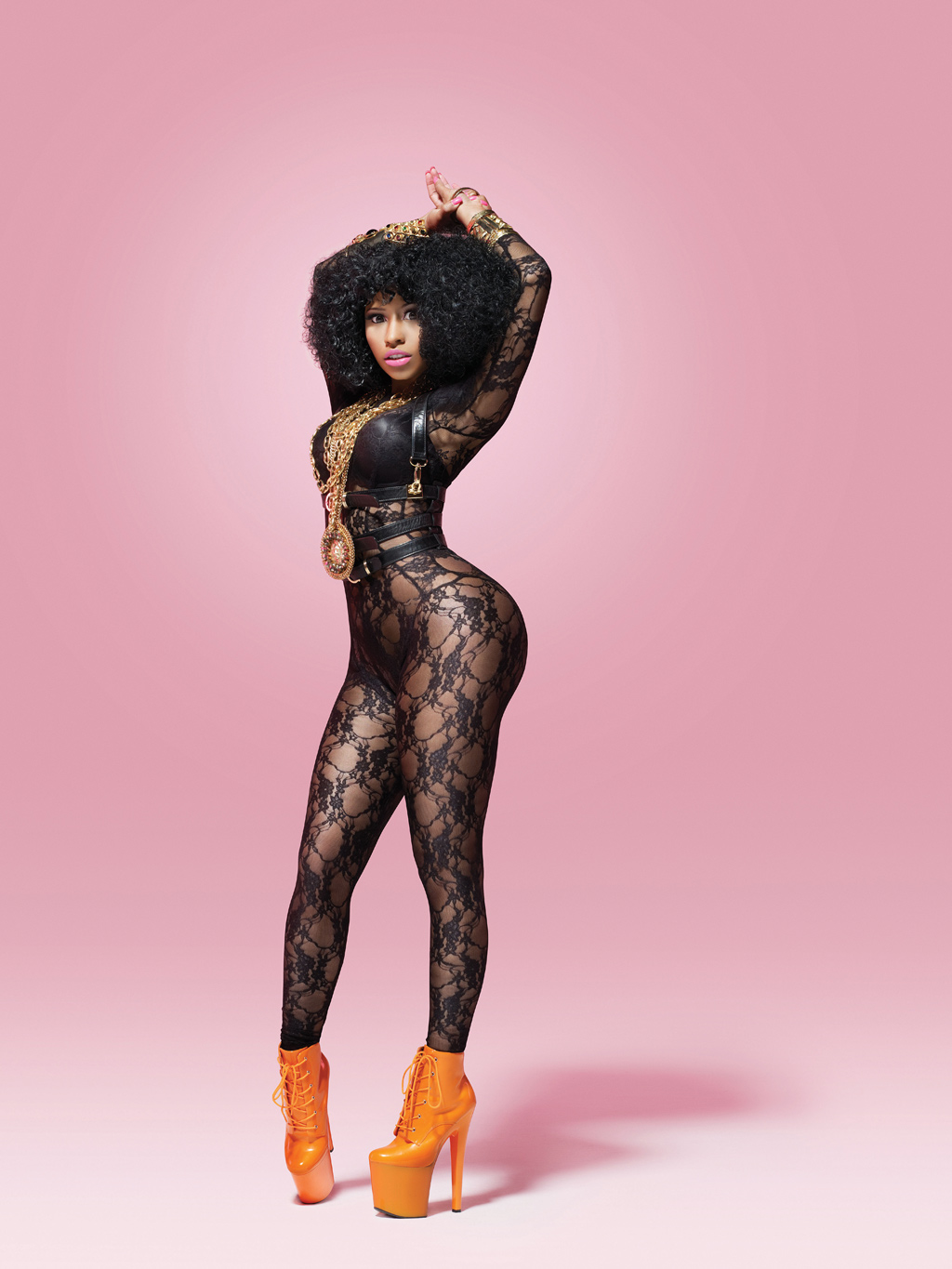
FIFTH PAGE FEATURE; I want to create a page reference which reinforces the musicality of my magazine by including upcoming tour dates for established Hiphop artists for my consumers to appreciate such as Nicki Minaj, Jay z, Kanye West, Drake, Lil Wayne, Ciara; I believe this will bring the musicality into my magazine after just stating the fashion and cosmetic feature. 


Here is my creation of the textual content of the page references;


Features


25 TYRA
In an exclusive interview, get the down-low on Tyra’s biggest inspirations and the truth behind the comparison to Nicki Minaj.
36 HIGH TOPS HITTING THE HIGH STREET
Sean Hunter asks why everything associated with Hiphop has to become mainstream.
46 CLONED
Established duo Cloned tell us their likes to their dislikes and why they’d love to collaborate with Kanye.
49 THE LAUNCH OF 'MIDNIGHT'
'Midnight' Tyra's new perfume has been launched, check out the latest perfumes from all your favorite artists.
51 UPCOMING TOUR DATES
Get all the latest tour dates upcoming to a city near you! Including…~Nicki Minaj, Jay Z, Kanye West, Lil Wayne, Drake, Ciara~ 

I have created a yellow block background for 'Features' to upkeep the theme of the yellow block background which sits underneath the title design for my magazine. As I want to create a black background for my contents, the yellow will contrast and stand out hugely on top of it. I want to include a 'Georgia' font for my text as I admire the simplicity of it which will stick to the conventions of textual font of Hiphop magazine contents pages. I want the text of the features to appear in a white colour to contrast with the black background and yellow block background of the 'Features'. I have used a bold font for the page numbers and capital letter for the title of the pages to highlight and promote the page references strongly. I have included the page reference for Tyra's Perfume Promotion however if I do not use the perfume in the front cover image I will not use this page reference and will replace it with:


 49 REVIEWS ON RHIANNA'S RANCY RAVE
Get all the gossip on one of the biggest concerts of the year and find out what the lady herself thought on her performance.


I have included alliteration to promote this page reference for it to become a catchy and engaging read. I have also included a concert as the content of this page reference to reinforce the musicality of the magazine. I want the whole layout of the description and titles of the page references to appear rotated slightly to the left. 


Creation of other text I want to appear on my contents page;

                    Inside
NOVEMBER 2012

I am going to use a grey front which will compliment the grey font in 'Features' and will also contrast and stand out on top of the black background.  I want the 'Inside' to appear in italics to add sophistication and draw a difference from the capitals letters used for the date and year to the title of my contents, Inside. I want to position this text at the top of the page to the right to make room for the 'S' I want to include on the left side of the page. I have decided I want to include an 'S' to reinforce the name of my magazine rather than the full name of the title. I was inspired to do this from the creation of the 'V' used by VIBE magazine on their contents page. I have used Lucinda Bright font for both texts. Here is the creation of the 'S'.


S
I have created the 'S' in a yellow font to compliment the 'features', and to reinforce the yellow used in the actual title of my magazine. I want the 'S' to appear slanted to the left like the text of the page references to show a slanted theme of the text across the page.

Wednesday 1 February 2012

Influential contents pages + initial ideas;

As mentioned before I want to use the same artist for my double page spread, contents and front cover to present a unique selling point and main focus for my music magazine. Below are three examples of contents pages taken out from Hiphop magazine- VIBE which have inspired my thoughts and ideas on the creation of my contents:


First example: I admire the positioning of the image and text on this example; I like how the artist is the main attraction of the page as he stands as the only image and largest item on the page however he is positioned around the text to draw attention and importance to it also. I admire the black background which compliments the artist's clothing and allows everything on the page to stand out. I also like the facial expression of the artist as it a brings a sense of musicality to the page as he is displaying a 'singing' pose. 


Second example: I am influenced by the background colour of this example. I really like the fading effect which has been created incorporating dark to light grey vertically down the page. I admire the style of the photo which is displayed in this magazine; I like the positioning of the artist as she is situated around the contents text and it is almost if she is hanging up the 'V' on the page. Even though she is a large feature on the page her leg positioning draws appropriate focus and importance to the text which is the smallest feature on the page. I admire the 'V' which appears on the page as it reinforces the name of the magazine in a subtle and different way compared to the normal style of the name of the magazine, 'Vibe'.


Third example: This image of these two artists is what has influenced me in creating a second image for my contents page of a Hiphop duo. I am influenced by these two individuals and have two people which I can use similar to the look which they give off in this image. I admire the contrasting pose of the two individuals- one is pouting, one has a straight expression. However I like their similar positioning of their bodies, one hand on hip;I believe this suggests confidence. I also admire the leg positioning created between the two individuals; the leg positioning brings the two individuals as one and suggests their 'togetherness'.


Initial ideas;

IMAGE-

I aim to use the same artist as I have for my double page spread on the contents however I want to include another image displaying another Hiphop artist to feature in my magazine.   Like the third example, I want to create a Hiphop duo to stand as my second artist; I have decided to create a duo as I feel that it will offer a variety of artists for the consumer to appreciate. I have found two individuals to use for the duo which are similar looking and will reinforce this through the name of the duo and unlike the third example, I will use similar outfits for the artist's to wear. I want the image of my original artist to be larger than the image of the duo  as I feel that it is still important for my original artist to dominate on the contents page as she stands as the main focus and USP of my whole magazine. I really admire the second example's style of image and aim to position my artist in the same sort of way to connote sexual references (sticking to the conventions of the Hiphop genre) and to provide an interesting position situated around the text. I want to ensure my main original artist is in different clothing to what she was wearing in the images for the double page spread to provide a whole different style and look for the consumer. The image of the Hiphop duo will appear smaller than the image of my original artist however I aim to take an image which is just as appealing and interesting to engage the reader.

COLOUR SCHEME-
I am really influenced by the background colour of the first example however if I am going to use it I want to ensure that the colour of the outfit both my artists are wearing contrast  hugely with the black background; I believe the black clothing that the artist is wearing on the first example does not stand out and want to ensure the clothing on both my artists appears noticeable against the black background. I aim to use different colours to what I have for my double page spread as I want the style and look of all three creations of my magazine to be different in some way to bring something new on each page for the reader to appreciate. I aim to use contrasting colours to follow conventions of 'upcoming' 'quirky' styles of Hiphop which I have reinforced in clothing colours for my artist on the double page spread. I think it is important that I include colours which are clear to see and which stand out on what ever they are up against. If I am to use a black background for my contents page like the first example I aim to use yellow and white colours for the text to compliment the yellow used in the title of my magazine and so the white can contrast with the black and follow conventions of colour schemes of Hiphop magazines.

TEXT-
As I aim to follow conventions of a typical Hiphop magazine to ensure my contents page appeals to its target audience I want to incorporate the word 'Features' as the heading of page numbers like the three examples above. I believe it is a sophisticated way of saying 'pages' and want to include this level of sophistication in my contents page. I also only want to include only a few features to provide the reader with to also follow conventions of Hiphop magazines; I will ensure these page numbers as appealing and hold a high level of importance to ensure I engage the reader. Unlike the examples above I want to call my contents page 'Inside' rather than 'Contents' and I also do not want to position the letters in the way they are in the examples above as I aim to present 'Inside' vertically across the page instead to make it clearer for the reader. I also want to include the month and year on the contents page in a larger form than the first example. I admire the 'V' as a subtle way of reinforcing the name of the magazine to the reader and would also like to include an 'S' or the full title name 'Superior' on my contents page as I believe it is really important to ensure the title is displayed in some way or another regularly through-out the magazine. Through my previous research of magazines I found that the publishers have understood the technological market and have used it to their advantage by promoting their magazine through technology. On my contents I wish to include a promotional feature which will advertise a subscription membership for consumers to make use of on all smart phones and computers. I also want to promote a digital version available of my music magazine to download on all smart phones, which will be cheaper than purchasing a physical print version to ensure my magazine can reach everyone.

POSITIONING AND LAYOUT-
I aim to position 'Inside' , the month and year at the top of the page, I aim to position my main image of my original artist at the bottom of the page in a similar sort of style as the second example and I aim to position the second image of duo artists more to the top of the page, smaller. I would like the 'Features' with the page numbers to appear on the right hand side in the page to follow conventions of the two examples and aim to lay the text out of the 'features' rotated to the left slightly to reinforce the 'quirky' look I want my magazine to hold.