Monday, 16 January 2012

Article content and layout- initital ideas;

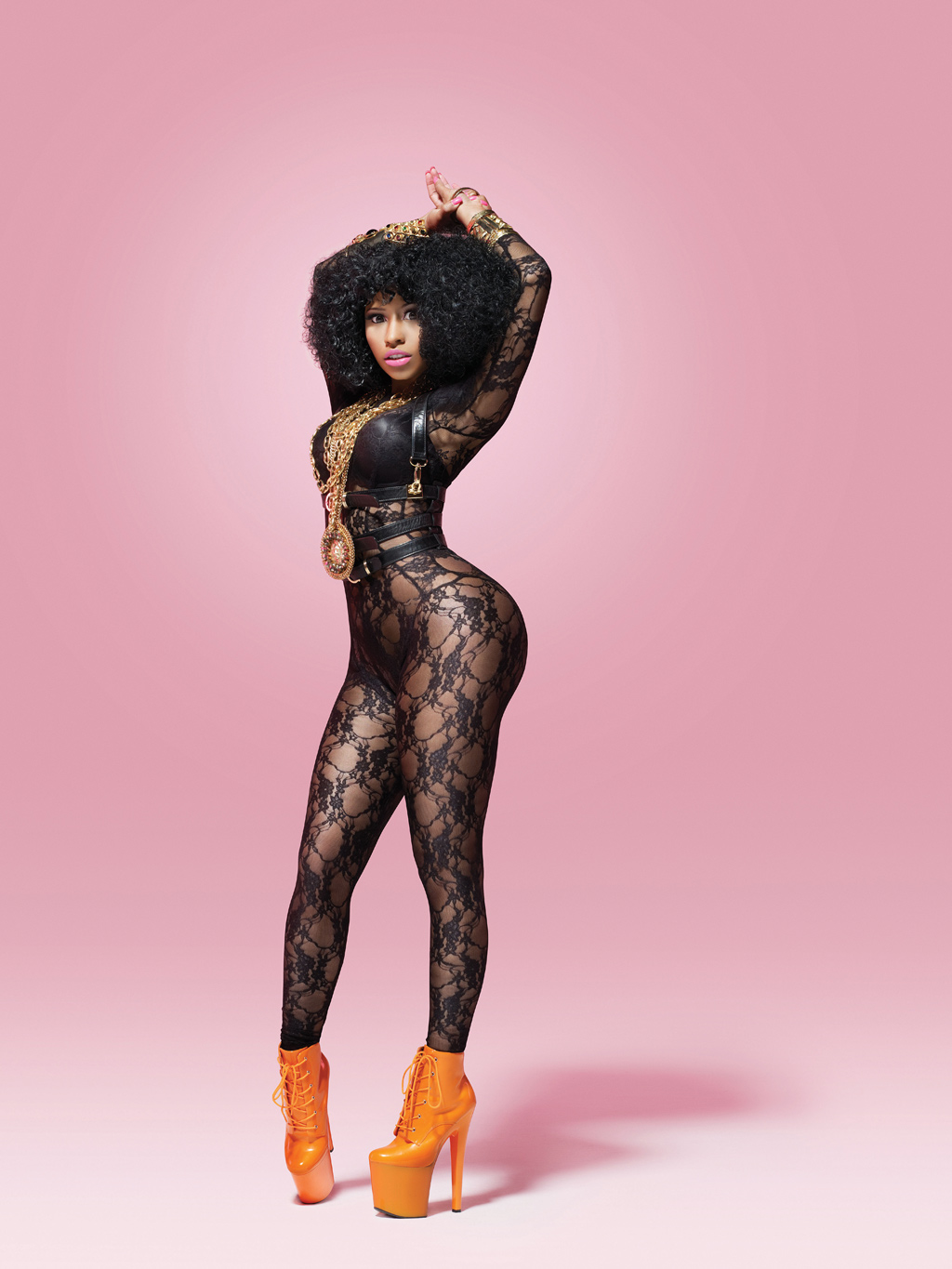
This example is the layout of a HipHop music magazine double page spread that influences me. I admire the use of images, and how the article fits in and around the image. I aim to create a full length image to stand as my main image and I aim to position it on right page more to the crease in the middle of the two pages to allow my image to draw a larger focus. I also want to use several other images of my artist at the top of both pages however unlike this example  I aim to create close up/half body length shots to appear to provide a variety of images to the reader. I aim to create a masthead of my artists name unlike this example, however like this example I aim to use a subheading which will appear as a brief insight in to the artist/article.  I believe I was most influenced by this magazine double page spread as it featured a female artist therefore there is a feminine feel across both pages; it has inspired me as I can relate to the use of image and layout as my double page spread is going to feature a female artist. 


Below is an example of an article featuring 'Bryan Baby Williams' a founder of Cash Money Records (a HipHop music company); 


This article starts off with an introduction in to the HipHop star and his current affairs and subsequent to this introduction follows an interview which XXL had with the star, with questions and answers. Out of all the articles I researched I was most influenced by the content and structure of this article; I admire the short introduction provided to the reader allowing them to get the latest on the artist and I admire the interview that follows this. The questions are open ended allowing the star to give a long response and I aim to use open ended questions to allow my artist to respond widely. Within the article a line reads: 'Where the fuck did everybody go? I aint never understood that.' The colloquial language put forward by this star allows me to recognize common terms that HipHop artists use such as 'fuck' and 'aint' and I am going to ensure I use such terms in my article to reinforce HipHop culture. 


Article ideas; 

Interview:

-10 open-ended questions, allowing a wide/long response
Types of questions-
Why have you chosen the HipHop music industry?
Who or what was your biggest inspiration and why? 
Plans for the future?
Who would you like to collaborate with most and why?
-I am to create these sorts of questions in a more chatty way like the article above, making the artist feel comfortable and allow it to be a relatable read for the target audience. 

Sub heading ideas; 
-Brief insight in to artist (3-4 lines)

Extras:
-Box at the bottom of the page which is incorporating other types of media.
-'Want to find out more-
-Facebook/Twitter
-Itunes 
-Apps for iPhones

Saturday, 14 January 2012

Influencial masthead +sub heading positioning and content;


I aim to provide readers with a masthead which stands as the largest text on the page. Like this example of a double page spread which features an article with Nicki Minaj , I want the name of the artist I am going to use, to appear as the masthead, however unlike this example I do not want text above it.


I aim to provide readers with a sub heading which I want to appear directly underneath the masthead. Like this example I want the masthead to be the artists name and I want the sub heading to appear underneath. I'd like my sub heading to be the same length as this example.


Potential names for my female artist to feature in my magazine;

Sienna

Bleu

Tyra

Tasmin

I carried out a questionnaire using 20 of my peers to come up with a final decision of a name for my artist. Here are the results:


From the results, I have decided to use the name, Tyra, for my artist that I want to use for the front cover, contents page and double page spread in my magazine. It was the most popular choice of names chosen by my peers and I was very glad that the results displayed this as it was my favourite choice. I chose the name Tyra as I believe it will suit the female I am using to feature as an artist in my magazine. Hiphop music culture is associated very much so with America therefore this name for an artist is perfect as the name originates from America.


Text font ideas for masthead on double page spread;


T Y R A (1)
T y r A (2)
T Y R A (3) 
 T Y R A  (4)
TYRA (5)
I carried out a questionnaire using the same 20 peers to help me make a choice of what  kind of font to use for the masthead which will feature on my double page spread. These 5 fonts were my favourite types of fonts however I wanted feedback from my peers. Below is the results on what they chose as their favourite option.


From the results we can see that the 4th option was their favourite and again luckily this was my favourite too so I was happy with the choice. I aim to use this type of font for the masthead on my double page spread; I admire the spacing of the letters of it, it suggests dominance and superiority which I want my artist to hold in the double page spread. It is also clear to read.


This is the colour scheme I want to use for my masthead on my double page spread:


T Y R A

I have chosen the colour red for the 'T' of the masthead and black for the rest of the font as I want to follow conventions shadowing the HipHop genre. From previous research I recognised common colours which were usually found in HipHop music magazines and these colours were red and black; red and black connote power and mystery and lyric quotes which I have picked out in previous research supports this. My artist is a upcoming new artist therefore I want some features and aspects involving her to be different and contemporary however I want to upkeep the conventional colour scheme of the HipHop genre. 


Subheading ideas;


Here are three examples taken from two different HipHop magazines, The Source and XXL:


The first example is an image of a subheading which is situated in between the reflection/shadow effect of the masthead. The content of the subheading displays a very brief line about the current state of the artist and then finishes off with a quote from the article which is to follow. I admire the reflecting effect of the title and the choice of location for the subheading; it is interesting and different from past music magazine positioning of the title and subheading. 

The second example is an image of a subheading which reads just a quote from the article which follows. I admire the content of this subheading as it provides the reader with the most significant quote from the article to intrigue and interest the reader to ensure they read on. 

However, I am most influenced by the first example as it includes a quote as well as a brief insight in to the artist's current affairs; I aim to follow this choice of content for my subheading, providing the reader with what I believe as the most significant quote from the article too. Also the first example has inspired me to display the subheading in an interesting way subsequent to the masthead as I believe it will allow my double page spread to look more appealing. I aim to situate my sub heading underneath the title however I would like to position it so it vertically reads down the page instead of horizontally keeping to the same length/level of the masthead. I would like the font of my subheading to appear in a simple font like example two however in a grey colour. 

Wednesday, 11 January 2012

Influencial artist for images on my double page spread;

Here are several images of Hiphop artist, Nicki Minaj. These images have inspired me to create images similar for the artist in my magazine, especially images which are going to feature in my double page spread. Nicki Minaj is a global Hiphop female artist who produces current mainstream music with the focus of a Hiphop/rap genre. I listen to her music myself, and love her image therefore I believe she is perfect to use her as inspiration for the images of the artist I want to create for my magazine.


First image: This image influences my thoughts for ideas on a full length shot of my artist which I want to include on my double spread page. I am most inspired by the platform, bright orange, high heels that she is wearing; they perform as a huge statement accessory and contrast with the black lace she is wearing allowing them to stand out. Her posture and pose allow the reader to benefit of a view which includes the whole of her body as she is streched out in a flattering position. Her oversized, gold coloured necklace is also a statement item and compliments her huge hair. The lace body-outfit she is wearing suggests sexual relations, as it lace and the wholes in the design are large, revealing lots of her skin. The sexual connotations that may lie with this image can be supported by the genre of music she is devoted to, Hiphop; as mentioned before, Hiphop music tends to make refrence to sex. One of Nicki Minaj's records, 'Superbass' reads lyrics of: 'He just gotta give me that look, when he give me that look, then the panties coming off, uhh.' From the recognisition that female Hiphop artists create relations to sex in not only their music but their image, I need to ensure that my artist holds a level of sexual connotations in her image through her clothing.

Second, third and fourth image: These three images of Nicki Minaj influence my thoughts on ideas for close up and half-body camera shots for the other images I want to appear on my double page spread. I aim to use three or four images of my artist featuring in the article as well as a main full-length shot of the artist; similar to one of the examples of a  double page spread in the previous post, I want these other images to appear at the top of the page however unlike the double page spread that I researched, I want these images to be close up or half-body length shots instead of full length shots, to provide the reader with a variety of shots of the artist. It is the contrasting bright colours which appear in the second image which inspire me the most out of the image; Nicki Minaj has said to of brought a new style to the scene of Hiphop by breaking conventions. In example, colours such as black and red have appeared to be quite typical in Hiphop magazines as they seem to represent parts of the Hiphop culture, connoting aspects of power, mystery and danger; however Nicki Minaj is known for her use of bright and contrasting colours and this inspires me to enable my Hiphop female artist to follow her use of colours. The black and white colour scheme through the third image has influenced me to aim to create an image which is in black and white; I believe the black and white colour scheme suggests sophistication and supports her seductive facial expression. I aim to create an image which holds a black and white colour scheme to show the level of sophistication and sexual relations that my artist displays. I also admire the use of direct mode of address in the image; I believe it is an eye catching aspect of the image and stands as a persuasive technique to grab readers in. The fouth image also influences me in my thoughts for a close up shot image that I want to place at the top of my double page spread- along with others. Nicki Minaj's lips are my most admired feature of this image; I wish to create an image where my artists lips are the feature which holds the most colour. I believe the lips also hold sexual connotations, and I wish to use red lipstick on my artist instead of pink to suggest a level of sophistication instead of following the 'Barbie' connotations that pink lipstick shadows.


Fifth image: This image also inspires me on ideas for images for my double page spread. I am most influenced by the pose Nicki Minaj is holding in this image. The pose displayed in this image is different to the previous images and I believe it brings some humour and 'fun' to the image. I would like to create an image for my double page spread which provides the reader with a humorous pose however I do not think I will use this technique for my main full length image; I wish to use a humorous photo for one of the four images of close up/half body shots of my artist which are to appear at the top of the double page spead instead. I also admire the background colour and effect which this image displays. It provides the reader with a darker pink and a lighter pink colour scheme, travelling vertically down the page which gives a fading effect. I admire this fading effect used for a background and I aim to use this technique for the page which holds the main full-length shot of my aritst.

Initial Ideas- Double page spread;


Colour scheme;
The colours which appear on double page spreads in Hiphop magazines all tend to follow a conventional scheme; the colours used normally consist of red, black and white so it is become clear to see that these colours are conventional and have now started to represent the Hiphop genre.
The colour red connotes danger and here is an example of how the colour red does seem to represent a sense of danger within the music genre, Hiphop. I have taken the following lyrics from a record who global Hiphop stars, Jay Z and Kanye West's produced: 'Niggas in Paris'
'If you've escaped what I've escaped, You'd be in Paris getting fucked up to'.
I have chosen this line from their song to show the threatening and dangerous nature and tone that Hiphop music put forwards to the industry.
The colour black connotes power and the following lyrics present the power and mystery representations Hiphop music can present:
'Bow in the presence of my greatness, You should be honored by my lateness.'
These lyrics were taken from Kanye West's record- 'Stronger' and shows him attempting to feel and be in authority and of greater power than others through the word choices 'bow' and 'honored.'

On my double spread page, I aim to use colours such as black and red to obtain the connotations that they hold; I want to upkeep representations of power, mystery, danger as I believe they are what differentiates Hiphop from other genres. However, my target is to include one other colour which isn't conventional in Hiphop magazines to bring my own personal style into my magazine; stereotypically, black and red are colours which appeal to a male audience and I believe by including a colour such as yellow, could bring more femininity to the double page spread to give it more of a balanced appeal to both genders. I like the white background used in example one and three and would like to use a white background for my double page spread as it does not limit my ideas for image text in any way; anything shows up on white and expands the choice for colours to use.

The text's font + style;
The size of the article text on Hiphop music magazine's double spread pages tend to be small. The text of the masthead on the second example is the largest text on two pages, presenting it as the most important feature on the page alongside the image. The largest text on the third example is the quote above the article which seems to be in place for a masthead and the largest text on the first example seems to be the quote which sits above the article text. The font of the article text on all three examples is simple lacking in any style or interesting features. Two example's display text in the colour black, reinforcing the connotations which come with the colour linked with the Hiphop genre and one of the example holds text in the colour white to contrast with the black background it sits on top of.

On my double spread page, I aim to use a masthead which will stand as the title of the article and I also want to use a quote which I feel holds importance and may attract the reader to read the article, underneath the masthead. I would like the masthead to appear as the largest text on the page and the quote to be the second largest text. I would like either my masthead or quote to appear in an interesting style like the third example; the third example's quote above the article text is slanted to the left hand side and I believe it allows the text to look more appealing and interesting. I aim to use simple font for the text of the article as a contrast to the sytlish font I aim to use for the masthead and quote as I believe it is important to have a varied appeal for consumers.

Image;
The images used on all three examples are very different from each other; example one has many images of the same artist displayed at the top of the page and one larger full-length one on the right page, the second example holds just one image of the artist which takes up the whole of the left page and the third example holds just one image also but it is a small image. All three main images hold direct mode of address however they all differ in their use of camera shot; example one is a full-length shot, example two is almost full length but the artist is sat down and example three is a half body shot which only captures the top half of the artist.  Example two and three are images which do not display anything interesting through the artsists facial expression, posture or pose and this allows the image to be very boring and dull. However, as these double page spread's are situated within Hiphop music magazines, which is a very specific genre aimed at individuals with a huge love and interest in the genre and their artists, the images will not have to appeal to them as they already appeal to their artist and their music.

On my double page spread, my aim is to follow the positioning of the image that the first example presents;I think it is a more interesting way of presenting images and gives the reader not just one but many images of the artist. I aim to use a full length image for one of the images, however unlike this example I aim to use different types of angles and shots for the other images instead of just full length ones again, to provide the reader with a variety of images of the artist. The artist I'm going to use for my double page spread will be the artist that I want to use for the main image for my front cover, and contents page; I want the artist to be female and to be the USP for my magazine.

Monday, 9 January 2012

Practice double page spread + proposal for my music magazine;


I put a together a practice double spread page on Indesign today; I found this very useful as it refreshed my memory on the program itself and enabled me to feel more comfortable when working through the tools available. I learnt how to put columns on to a double page spread, how to rearrange text, how to place a heading and sub-heading, and how to place an image. As I am going to be creating my double page spread first out of all 3 creations, these are all basics things I will need for the construction of it and I am glad I had a practice before hand.


Proposal for my music magazine 

I aim to target an audience which consists of both males and females, aged 18-30. I do not want my magazine to have a target audience which is just targeted at one gender as I believe it limits the number of readers and also would not relate to the genre of my music magazine as the genre I am going to draw a focus to is targeted at both genders. When researching magazines with the same genre, I found that Vibe magazine targets females and males 18-34 years and XXL magazine- 15-34 years. I also aim to connote sexual relations and use taboo language therefore making my target audience aged 18+, I will be able to do this.


The musical genre I aim to use is, Hiphop. TheHiphop genre is a huge genre consisting of lots of artists therefore this will make it easier for me to be inspired and influenced when creating the images and styles to feature in my magazine. I have chosen this genre as its a genre that I would tend to associate myself with; I have always loved listening to this type of music and am intrigued by the Hiphop culture and scene. It is also a genre that is appreciated by many people, and is continiously growing consisting of upcoming and new artists which bring their own sense of style to the industry, so audiences are never bored. Even though the Hiphop genre holds many conventions which the artists and culture seem to follow, the new and upcoming artists are bringing something new and different to the scene; I have understood this and aim to bring this to my magazine as well as following conventions.

I am going to create the front cover, contents page and a double page spread for my Hiphop music magazine; I aim to use the same artist for each of three creations I am designing to put forward a USP for my magazine- the artist. The artist I want to create will be a new and upcoming  British female Hiphop artist which has been hugely influenced by other new faces of the HipHop scene such as Nicki Minaj. I want to create images of my artist which are modern, quirky and interesting as I believe this will attract audiences which have not heard of her before easily. 

Title names that have come to mind so far are, Superior, Mixxx, XXO. Each name holds connotations which relate to aspects of the HipHop genre. In example, Superior, connotes the power aspect which is usually associated with the genre, Mixxx connotes musical elements as you usually mix songs or DJ equipment and the name, XXO, inspired me through the name of an existing HipHop magazine, XXL. 

I aim to incorporate technological devices within my magazine as through my previous research I found that most magazines today are understanding the current technological market and are using it to their advantage to provide more modern and easier ways of accessing their magazine. I aim to promote current social media sites on my double page spread as other ways for readers to find out more information on my artist. In addition to this I aim to promote apps available for consumers to make use of on their iPhones. I aim for the app to be a promotional aspect for technology and my artist as the app will be associated with them. 

I am going to ensure my music magazine is published by Intermedia Partners. This publishing company publish Vibe magazine each month, which is a Hiphop music magazine also. The company have reinforced the magazine online as well as still selling physical print issues too and I would like the company to allow my magazine to be accessible online as well as in the shops. Vibe magazine also belong to a conglomerate company called Vibe Lifestyle Network and I would like my magazine to belong to this network also to promote my magazine widely and to gain financial support.

Sunday, 8 January 2012

XXL music magazine;


Having researched many magazines and their music genres, I have now decided that I want to create a music magazine with the focus of R&B and Hiphop genre. Having deconstructed three music magazines with this genre, I was most influenced by XXL in terms of style, image, layout + positioning. I had never heard of this magazine before I came across it during research and the following is more of a detailed insight into the magazine so then afterwards I will have more of an idea on the creation of my own music magazine.

XXL is a music magazine produced and published by Harrison publications devoted to the music genre of HipHop and was first founded in 1997. The music magazine is available in a physical print and also holds a website which provides Hiphop news, original content and content from the magazine which holds a focus in and around the artists which specialise in Hiphop.  

The magazine incoporates social media to promote and expand their magazine online such as Facebook and Twitter. I can see that XXL have understood the growing social media market and incorporated their magazine in to global social media to make their magazine more accessable by using current and easy ways to get it 'out there' to consumers. I want to make sure that my magazine incorporates other types of media to connect globally with potential consumers. I believe by incorporating other social media also allows people to recognise the target audience of your product. Social media is a current, new, growing market which relates to the genre and audience of XXL and the music magazine I want to go on and create. The genre is current and growing-Hiphop and the people who consume this genre are typically young 15-35 so it makes sense to incorporate a current, new and growing market for the magazine to be consumed.

The photos which feature on the front cover of XXL magazine issues;


All three magazine front covers hold an image which is fairly close up, they all hold direct mode of address as they are either making eye contact with the audience or just looking out to the audience, and each are shot alongside an object of some sort. The first image is the front cover with Ludacris on, the image is shot of him and a camera, the second image on the second front cover is of Doctor Dre and he is behind a board of chess, and the third image on the third magazine is of Jay Z who has a cigar in his mouth. These objects are interesting to me as they bring something different to a typical magazine front cover; not only is it the artist which is featured on the front cover, but an artist with an interesting object alongside them. This has influenced me to shoot an image for my front cover with my artist situated with or alongside a particular object; I believe it brings something new to the typical music magazine as none of the objects are even suggest connotations to the music industry.

All three images are the only image on the front cover, and the rest of the features which the page consists of are cover lines, and the title; this suggests that XXL magazine front covers are typically simple but hold enough to grab potential buyer’s attention. The biggest text apart from the title appears to be the artist who features on the front covers, name. This suggests they are the USP of the magazine are featured in it to appeal to the target audience the most.
The colour scheme through-out all three front covers are very coordinating and similar to each other. They all consist of white and red text with the exception of the second front cover using blue and yellow colours for some of the text. I like the colour schemes which are used on all three and throughout my research of Hiphop magazines I have discovered it the colours are rather conventional and I am thinking of using these colours in my own magazine front cover.
 
The layout of all three is similar; the title is positioned top left always, the main image covers the whole page and the text is situated around it. I like the layout as I think it is clear to read and notice all the features however in my magazine I would like to include more interesting styles of font and positioning to allow it to become more attractive and appealing.

Contents page analysis;


The contents page for XXL seems to follow the same style as most of their front covers, simple, minimalistic, and colour coordinating. ‘A-side’ is the largest text on the page and is the first thing that may grab the audience’s attention and makes them read on; it is located at the top of the page, in a banner style. The font is sans-serif which relates to the modern market which the XXL is aimed at. The current issue date is placed at the top of the page to fill the space and alongside this there is a smaller version of the title in alignment with the list of pages and their headings, this is used to remind the audience that they reading XXL; the name of the magazine is repeatedly displayed beyond the front cover and within the magazine to enable the current reader to possibly recommend the magazine to others, subscribe or even access their online website.

This contents page was taken from the magazine which holds the second front cover above- the one which features Doctor Dre as the main image and again he is used here. This reflects his significance within the magazine and also suggests the unique selling point of the magazine once again. He is wearing black on the image in the front cover of the magazine and here he is shot in black too; the colour black is a conventional colour worn by most artists following a Hiphop genre and connotes power and mystery. The shot of Dr Dre presents him as a dominate figure in power due to his posture and pose. In addition to this the low angle shot allows him to look bigger than he actually is which also represents him in power or superior to others. The spacing above his head is filled with a quote stated by the artist allowing the reader to want to read on and turn to his article. The image of Dr Dre stands in front of a shadow and this is an effective and attractive feature to the contents page which subtly appeals to the audience visually.
Above the list of page numbers alongside their headings, reads 'Cover Story' allocating the reader to the main article which the magazine features; this persuades and interests the reader to go to this article before they have even started to read the other page references. The rest of page numbers and their descriptions consist of bold and larger text for the heading and the description appears to be of a lighter colour and not as bold font; this suggests the importance of the header over the description.


Double spread page analysis;


  This double spread page taken from XLL is taken up by text and image and from this example we can learn that the image has more dominance and presence over the text. This is the article which Doctor Dre features in and it from the same issue of XXL which he appeared on the front cover and in the contents for. The whole double spread appears in black and white and this suggests a level of sophistication however it also reflects a dull and boring mood which the two pages seem to hold. Doctor Dre holds an emotionless expression yet holds direct mode of address with the audience. Again, he is wearing black which connotes power and mystery however he does not hold a dominant presence like he does in the other images within the magazine, in fact he doesn't communicate anything in this image which is disappointing as he is a huge star and the audience have been given the privilege to share the article with him.

The title of the article is the largest text on the two pages and is situated above the text of the article; it is black text which stands out in front of the white background. The rest of the text on the page is a whole lot smaller yet still black to contrast with white background; the questions are in bold whereas the answers are not which gives difference to what are the questions and what are the answers.
There is not a lot more to this double spread page than image and text however it does communicate the end of the continuous build-up of Doctor Dre; he was the main focus of the front cover as he featured in an exclusive interview with XXL. I like the sophistication of this double spread, and I find the simplicity of it appealing too however I do think it would of become more appealing if it include more colour; however this was the style/theme that XXL was keeping to with the focus of him so therefore it would of looked out of place if there was a sudden use of pink and orange around him. I like the idea of the text being on one page and the image on the other and this particular double spread page has influenced me to follow this layout in my double spread page.

Hiphop magazine deconstruction's;

As I want the genre of my music magazine to hold a focus of HipHop, I have now moved on to a complete focus of this genre. Below are three deconstructions of the front covers popular music magazines which specialise in this genre.                                                  
                                       
Vibe;
Colour scheme: The colour scheme through-out the front cover of Vibe is very coordinating however it is also basic, consisting of just three standard colours , red, white and blue. The background consists of a fading effect, appearing dark to a lighter blue horizontally across the page, this is effective and allows the text on the lighter side to visually stand out; the red and white text which lays on top of the blue background is visually clear for the reader. The colour scheme across the page also allows the main image of the page, Keri Hilson, to stand out as she is a huge contrast to the blue white and red as she is wearing black. We can argue that the colour scheme may hold stereotypical gender refrences as the colour blue is typically associated with males, however the music Keri Hilson produces makes up for this. She produces music which is mostly aimed at females therefore the artist herself will be able to appeal to a female audience whilst her sexual nature in this image and the colour scheme, blue, will appeal to a male audience.

Text/font/style: The font of the text is very simple through-out the front cover, it is presented in a very minimalistic style; the text is displayed in short and simple statements promoting features within the magazine: 'Keris Hilson has been a very bad girl.' The majority of the text appears in bold which highlights the emphasis put on to what is stated, in example the title is the biggest and boldest text on the page allowing the most important part of the cover to stand out the most. The style of the cover in general is sexual however the musicality of the magazine is noted through the names of the artists who follow the music magazines genre, R&B and HipHop are situated around the main image: 'T.I' and 'JayZ'

Main Image: The main image is of Keri Hilson, a successful female music artist which provides her fans with music which specialises in R&B and HipHop- this allows her to highly connect and relate to the genre of the music magazine. As she features as the USP of the magazine cover we are able to see that she plays a huge part in the appeal of the magazine as she is the only and biggest image on the cover. Her pose and posture is of a sexual nature and the lack of clothing also supports this; this allows her to stereotypically appeal to male audience and her presence in the music industry allows her to appeal to either genders. She poses in a black torso suit with a police-men shaped hat. She appears to be confident and holds direct mode of address with the audience allowing the magazine to be eye catching and gripping. The colours she's in, highly contrasts with the other colours on the page allowing her to stand out.

Positioning + Layout; The magazine cover follows a conventional layout of a typical magazine; main image in centre, cover lines either side, and masthead situated at the top. As this magazine cover lacks in text and image, Keri Hilson and the title becomes the main focus of the cover due to the positioning and size and allows the audience to become aware of the genre immediately.

The Source;

Colour scheme: The colours through out this front cover follows a gold, red and black scheme contrasted with the white background which lays behind the text. The white behind the text and image allows everything important and bold to stand out allowing features to become noticeable and clear for the reader and in addition to this the black suit which Chris Brown is wearing coordinates with the black text situated around him. It is suggested that this magazine may appeal to more of a male audience than a female due to the colours as black and red are colours which stereotypically appeal to a male audience.

Text/font/style: This issue of The Source seems to hold more text than the front cover of VIBE however the main image seems to still be the main focus. All the text on the page appears in bold and reads cover lines promoting features within the magazine e.g 'How to be hotter than your summer'. The font of the text is simple and bold and is kept to through-out the front cover. The title of the magazine follows a shadow effect and is the most largest piece of text, covering the whole width of the page, allowing it to also become the most important feature of the front cover as well as the main image. The style and positioning of the text is more interesting than Vibe as it not just going horizontally across the page, in example 'CHRIS BROWN' is positioned down the page allowing the text to follow an interesting style to appeal to the audience.

Main image: The main image is of Chris Brown, a male artist which specialises his music in the genre that the magazine follows, R&B and Hiphop. He is a successful and well known artist and through the large image we can understand he is the USP of the magazine; potential consumers will recognise him and he will attract them to purchase the magazine due to his presence in it. He is holding direct mode of address with the audience and his outfit coordinates and contrasts with the background and text allowing him to stand out.

Positioning and layout: The magazine cover also follows a conventional layout of the positioning of the features, text and image on the cover however in contrast to Vibe, this magazine front cover positions its text in a more interesting way to attract its audience. The text isn't just positioned horizontally across the page, 'CHRIS BROWN' is expressed vertically to allow the style of the front cover to be visually more attractive and appealing. However the masthead, the main image, and the other text are all situated in the same way as Vibe as mostly all other magazines.


XXL;

Colour scheme: The colours which appear on this front cover are, red, white and black which are colours which have been used in the previous front covers; this allows me to understand that this genre may follow certain conventions which it comes to colours. The background is black allowing the red and white text to appear bold and clear on top. Again, it may be suggested that these colours stereotypically appeal to a male audience however the use of artists which appeal to both genders will balance out this assumption.

Text/font/style: Again, there is a lack of text on this front cover allowing the focus to be on the main image however the text which is available is small apart from the text which appears under the main image. The text which is situated on the right of the front cover is small in its length and size however the text which appears under the main image makes a clear connection between what is being stated and the image allowing it to become the USP and main focus of the font cover. The font which appears under the main image is again simple and bold but however, surprisingly holds the same dominance as the title does on this front cover. The style of the front cover is minimalistic in its font however does still communicate the musicality of it through the image of artists and language used such as: 'Rap' and 'HipHop'.

Main image; The main image consists of two music artists, Nicki Minaj and Drake which hold a focus of R&B and Hiphop in the music they produce. Unlike the previous two front covers, unconventionally this front cover holds two music artists which suggests a stronger influence and attraction this magazine may create due to the chance of an individual appealing to either one or two of the artists which feature on this front cover. Both artists hold direct mode of address, grabbing the reader in and we are able to see more of their body unlike The Source magazine; this suggests they may be able to attract potential consumers due to their clothing, posture and pose e.g Nicki Minaj's pout and facial expression which holds sexual relations which may stereotypically appeal to a male audience.

Positioning and layout; Unlike the other two front covers, the title of the magazine is located on the left of the page and is shorter therefore not taking up the whole width of the page; even so the title is still noticeable as it in white and bold text on top of a red background. The positioning of the text which states 'Nicki & Drake' is unusual in comparison to the other two front covers as it is almost as large as the title and is situated in the middle of the bottom of the page. These differences allow the layout of the page to become more interesting and different in comparison to the other two front covers and suggests more style to attract and appeal to potential consumers.