Monday 30 January 2012

Double page spread- Final design;

After editing my images and placing them on to my double page spread, I added in the 'extra' at the bottom of the right page. I was originally going to just display a Facebook, Twitter and App promotion however after placing all three on the page, there was still a bare white space therefore I filled it in with the conglomerate company I mentioned in my proposal that I wanted my magazine to belong too; www.vibelifestylenetwork.com for readers to get more information on my artist as well as others. I also added the page numbers and next to them, reinforced the name of my magazine to follow conventions of a typical magazine. After this I added in the quote taken from the article which I have placed on the first page situated away from where the article actually reads the quote; I did this to provide the reader with the quote before they actually get to the part where it is written in the article.

Here is my final creation of my double page spread;


Double page spread development;

Flatplan of double page spread;


I created a flatplan of my contents page to ensure that when it came to the creation of my first mock up of it I was able to follow a structure of layout and positioning.


I put together my first attempt of the creation of my double page spread with unedited images, unaccurate text + image positioning and absence of quote following the structure of my flatplan. I have put a first attempt together as a practice and subtle guidlines in what I want to achieve in my final design. I have a lot of changes to make but I have found it very useful doing a mock up as it has highlighted any errors and room for changes which I can add to my final design later.
Here is my first attempt:


Changes and development after mock up

Here is an image after I processed the appropriate editing skills on to the three images:


I have placed a 'thick thin' border line around each image. I have chosen a black border for the first image, a red border for the second, and a grey for the third. My choice of colours was influenced by the existing colour scheme on the double page spread, I feel that the colour of the borders compliment the colour scheme through out the two pages. I have also rotated the first and third image slightly; I have rotated them opposite ways to each other to create a reflecting and contrasting look which is also reinforced through the different facial expressions. The style of the borders also suggets a 'frame' therefore bringing a sense of 'fun' to my double page spread as well as to the artist herself. I also had to edit the paragraphing spacing in order to fit the article text around where the dips of the border enter the collumns to ensure it looked neat and in line. As I have chosen to place a border around these three images, I felt that the exsisting background colours of the three images were suitable for my double page spread as they were; therefore I did not fill in the backgrounds white to blend in with the background behind due to the presense of the borders in place. 


I have decided to edit the first full-length main image on Photoshop to gain a white background behind my artist throughout. Here is the finished version:
I did not want to edit the colour scheme or any other effects on to the image  as I wanted to keep the same style of images through-out the double page spread however I have cropped out her shoes as I felt that as the original photo did not show all of the shoe, it would be better to crop them out all together as they didn't hold any importance or dominance within the image. As shown on the flatplan above, I originally wanted the main image to be located on the right page, next to the middle margin of the page, however due to paragraphing and text difficulties I could not stick to this plan after trying it out on my first mock up, however I prefer the final positioning of the image as I feel that the reader will be benefited on both pages through images rather than just one; it spreads them out and takes away the 'messy' and 'busy' look from the second page which it held when the image was situated there. 

Sunday 29 January 2012

Photos for double page spread;


Today I created the four images of my double page spread. I have created the first image to appear as the largest main image on the double page spread and the other three images are to appear at the top of the double page spread, in a size smaller than the first main image. All four images have been developed on to my blogger how they were shot on my camera, I increased the brightness level on the shooting mode setting on my camera however have not performed any further editing. 

First image: I have created a full body-length shot for the main image. I have done this as I believe it is important to provide the reader with the full body image of the artist to either inspire the reader due to the presence of the fashion or to generally interest the reader with clothing and positioning. I have chosen to use contrasting colours when putting an outfit together for my artist. Even though the black and white colours in the leggings compliments the black strip down the front of the bandeau top, I believe the yellow polka dot of the bandeau top contrasts with the symbolic pattern on the black and white leggings. I have chosen to place my artist in this particular bandeau as it connotes sexual references due to the shortness of it revealing her stomach and because it is also an item which is currently fashionable and this will relate to her status in the industry: 'upcoming and new'. I have chosen black and white symbolic patterned leggings for the to wear on her bottom half as they are also very fashionable currently and are also a huge contrast to the bandeau ensuring her look is 'different' 'quirky' but also currently fashionable. The choice of clothing enabled me to ensure she holds a simple position and pose through her body language. I felt that a busy position and pose with her body would make the image look to busy, and take away the 'busy effect' from her clothing; I chose to have the artist at a complete stand still. However, to make up the simple body language, I chose a fierce facial expression for her to hold and also ensured she held direct mode of address with the readers to visually engage and attract them.

Second, third and fourth image: I have placed my artist in the same outfit as the first main image on all three images as I want to hold this same theme throughout my double page spread. I have rotated the second image once clock wise; I have done this to show a different layout and positioning of my images and to also compliment the third image as I have rotated it once anti-clockwise. In between the second and third image, will sit the fourth image; I have done this to create a reflecting look but with a twist- as each image holds a different facial pose. I have chosen a pout facial expression for the second image; I believe it is a 'quirky' look and also connotes sexual references as the lips are emphasised through the 'pout'. I have created an 'innocent' look for the third image through the camera angle I used. I took the image from a high angle to emphasise the size of her eyes to create an innocent look. I have also placed her hand on her cheek to show off her contrasting blue nail varnish and to also add sophistication and maybe even a touch of seductively to the image. I have not rotated the fourth image as I want this image to appear in the middle of the second and third image. In this image I have created a 'cheeky' look for my artist through the wink and the presence of her tongue. All three images are different in their facial expressions to connote three different aspects of my artist's personality; cheeky, innocent and seductive.

Monday 23 January 2012

Name of magazine development;

As mentioned in my proposal, I have three ideas for names of my magazine; 'XXO', 'Mixxx' and 'Superior'. I carried out a questionnaire using 20 of my peers within the age group of my target audience to come to a final decision of the name of my magazine. I need to come to a decision now as on my double page spread, I have discovered I need to reinforce the name of my magazine at the bottom of each page, which will appear next to the page number.
From the results, we can see that 'Superior' was the favourite choice. I was very glad with what the results displayed as this or 'Mixxx' had been my favorites from the start. 'Superior 'connotes the power aspect which is linked with the Hiphop genre and will also compliment the types of images I am aiming to create; confident, forward and power associated types.  


Title design development; 

SUPERIOR.
(FONT- LUCIDA BRIGHT)
This is the font and colour scheme that I want to create for the title of my magazine. I have created a yellow block background for the grey text to sit on so it can contrast by standing out. The aim is for this title design to sit upon a white or grey background, but I will later decide when in progress of my front cover. I needed to design the title as it is a feature I want to include on my double page spread to reinforce the magazine as it will stand as a reminder for readers. This title design will appear at the bottom of my double page spread, on both pages, next to the page number. I created this title design using the program, Photoshop. I had to create the colour grey using the available feature to do so; I did not like the grey provided by the program as I found it too light, therefore I created different greys, which were a lot darker, untill I was eventually satisfied. To the right is a shot of the feature I used to create the colour I wanted, at the bottom of the swatch colour list, is the grey I eventually used. 

Friday 20 January 2012

Textual development;

So, Tyra, did you ever think you would ever be where you are today, in the music industry?
Not at all. I mean, I've always known that I wanted to be a singer/rapper since I could talk, but this is something else, I'm loving every minute of it! Right now, the skies the limit boy!
The Hiphop genre is a continiously growing genre consisting of many many artists, however, what is it about you that is different from the artists which contributes originality to the industry?
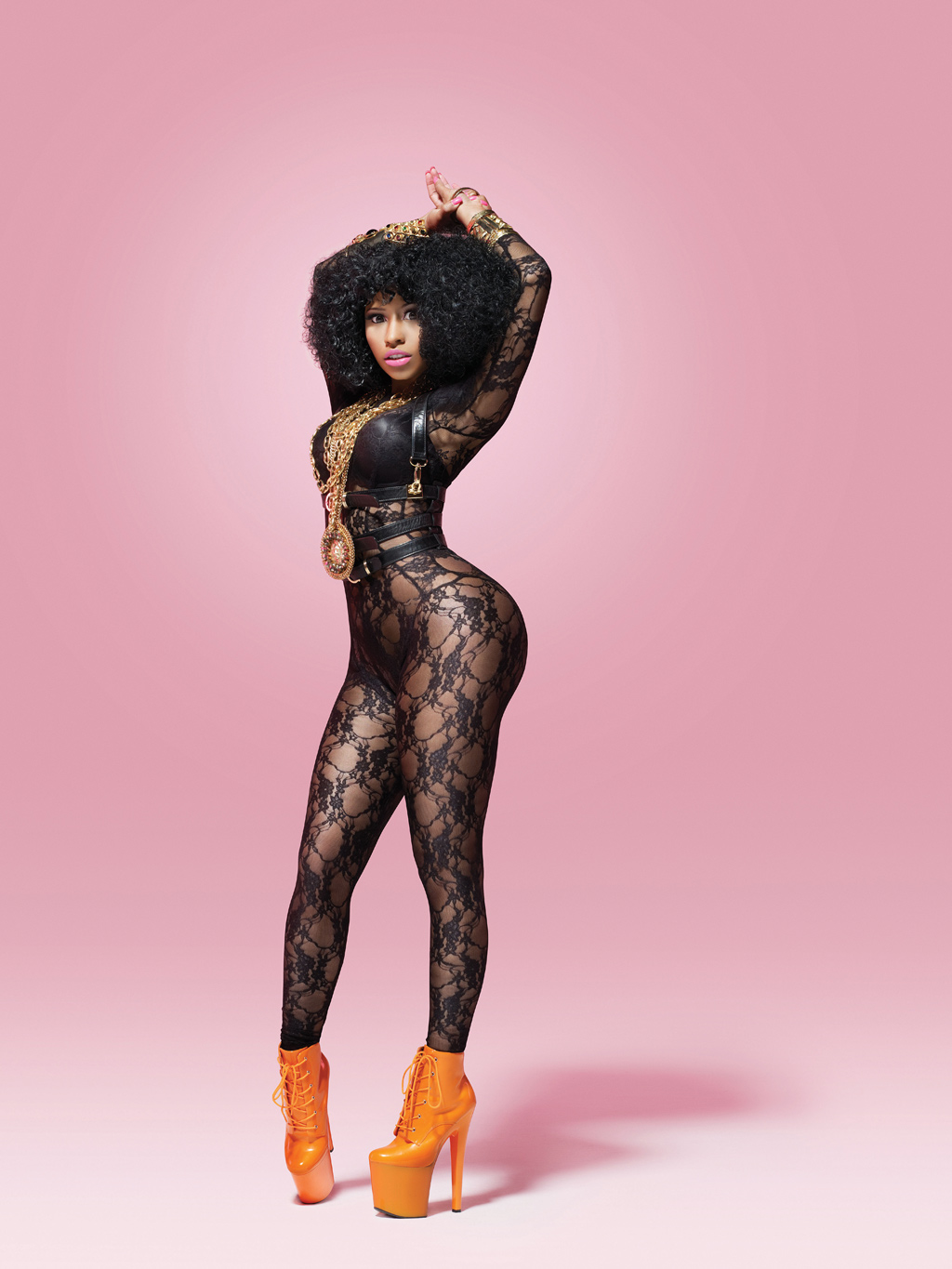
Image wise, my natrually huge curly blonde hair seperates my image from a lot of artists, however music wise, I think, being a female artist, its the rap approach I take to my music, I love a good rap in all my songs! I think its a statement thing as well; that girls can do is just as well as boys..
To of got where you are today, you must of been influenced by individuals belonging to the music industry.. Who have been your biggest inspirations that you have shadowed up until now?
Well, I was brought up with mo-town music, my parents were devoted to it, so I guess Diana Ross was one of my biggest inspirations. But as I got older, from about 10-15 years of age, groups like Destiny's child and TLC were my inspiraions. But my current, biggest inspiration that influenced me in to taking the Hiphop route into the music industry since the age of 17, has to be Nicki Minaj. She's just amazing.
You've been refered as the 'English Nicki Minaj' many times since the start of your career. Has this had an affect on how your fans or even how you percieve yourself?
I just think its a huge compliment to be compared to Nicki, she's an inspiration to many young people, she's just such an individual who brings her unique style of image and music to the industry and its hard not to get influenced by her. I love her approach to music and I do think we are similar in our styles of music but at the Grammy awards not so long ago, we had a little joke, she winked at me and called me an English Nicki, then hugged me and said 'at least someone can appreciate my individuality.' I just said 'what the hell are you on! Everyone loves you!' But I suppose thats all part and parcel of being involved in an industry which is exposed world wide to millions of people, you're never going to fully escape from your insecurities and you're never going to fully escape from your haters, but I say f**k the haters!
Now your a global Hiphop artist are you more aware of your insecurities than you were before you were in the limelight?
I think every one has their own little insecurities that get them down now and again. I used to be really insecure as a teenager, but then isn't everyone? Now, it's different, I've grown with confidence. My fans have given me a great sort of confidence so when I feel concious or insecure, I just think of their support and feel tones better!
What would you say one of your insecurities are?
Oh um.. It has to be my knees! I've never liked knees in general, but my knees are just ew! Haha!
We have only seen you collaborate with Kanye West and Jay Z so far.. What did you enjoy most about recording and performing with them?
Oh wow, these guys are so great! Considering my song with Kayne West and Jay Z was only my third song that was ever recorded, I honored the opportunity. They are huge inspirations as well, everything they do is just effortless and they just have this 'swag' about them which is just brilliant for the Hiphop industry. I think I enjoyed being able to sing more than I ever have whilst peforming and recording with them. Most of my songs have a larger rap approach than a singing approach so when collaborating with these guys, gave me a chance to actually sing more than I did rap. I'd love to do something with them again in the future, I loved every minute with them, you aint ever gonna' get any better than those guys!
If you could collaborate with another artist in the future, who would it be and why?
Ah, thats a tricky one! There's so many artists I'd love to team up with! But I have to say, I'd love to do something with Nicki Minaj, I have so so so many ideas for it. We've spoken about it in the past, but we've both just been so busy with the creation of our current album, so I think it will be something we will plan to do in the future.
Your first album was released earlier this year and was a smash! What have we got to expect for your second album?
I know its come around so fast, its just work work work. But I love it. I couldn't see myself being as happy as I am rushed off my feet all the time in any other job, its just great! I'm just in current progress half way through the second album which probably won't get released till next year. I'm completely solo on all my songs for this album, but I think some of the songs may come as a bit of a surprise to my fans.. and thats all I'm going to say!
It's been an absoloute pleasure, Tyra. One last question before you go.. What are your plans for the future?
Well, after the creation of my second album, and the tour that I have coming up early next year and the booked concerts, I think I am going to have a 4 week holiday in my hometown, Barbados! I think by the time my second album is released, the tour and concerts are over, I am going to be absolutely nackered, so I think it will be really good to just take a month off, and have some me time. But after, I'll be straight back doing what Tyra does best!


Subheading;
'The new face of Hiphop has entered the scene of music with a bang! With the success of her first album shadowing her every move, Tyra is beginning to make a dominant stand in the industry. Tyra tells her tale...'
- I have chosen to create a subheading which displays the genre of my artist as I believe it is the most important aspect to an artist to then ensure it appeals to consumers. I have always chosen to use alliteration: 'Tyra tells her tale' to allow the subheading to appear catchy. I have changed my initital aim of using a quote as well as breif insight as I think it will be more interesting to position a quote of the article around the text of the article and I also didn't want my subheading to appear too long.

Quote displayed amongst article text;
"...you're never going to fully escape from the haters but I say f**k the haters!"
- I have chosen to use this quote from the article as I believe it is the most interesting lines of the interview. It expresses Tyra's true feelings and will therefore engage the reader. It also incorperates a swear word which reinforces the Hiphop genre.


Masthead, subheading and quote;
T Y R A
The new face of Hiphop has entered the scene of music with a bang! With the success of
her first album shadowing her every move, Tyra, 22, is beginning to make a dominant stand in the industry. Tyra tells her tale...


...You’re never going to fully escape
 from the haters but I say f**k the haters!"


At the bottom right of the second page; EXTRA-


       Want to find out more..


       -Follow Tyra on Twitter,          TYRA.TWIT.       


          -Or visit her Facebook page www.facebook.com/Tyra  


Or get Tyra’s  FREE new personal app for iPhones +iPad                                           


-Mix all her new tunes into one gigantic smash hit! 
-Use all her styles of transitions in to and out of each song you mix!


Summary;
**I have incorperated taboo language such as: 'F**k' in the responses of my artist as I believe it connotes aspects of the Hiphop culture by reinforcing the conventional 'slang talk' which Hiphop artists follow. I have also used colloquial language such as: 'aint' as through my research I also discovered that thing sort of language was typical amonsgt Hiphop artists. I have chosen to create the questions in a red font as I want my double page spread to follow a clear colour scheme through both pages; the red font of the questions compliment the red 'T' in the masthead and the grey font of the responses support the grey font of the subheading.
 I have used red and black colours to connote aspects such as power and mystery which is typically associated with Hiphop culture. I am going to place the subheading directly underneath the masthead in a horizontal position. This wasn't my original plan as I wanted to place the subheading in a more interesting way, vertically, however my aims for positioning of images and articles will prevent me from doing this and I believe they are of more importance than displaying the subheading in a different way. I believe it looks neat and gets straight to the point with positioning my subheading like so. I have chosen to create the font for my subheading in italics to bring a sense of style to my double page spread.
I have created the 'T' of my subheading in a bold and larger font in comparison to the rest of the text; through my research I discovered that this was a typical feature included in most music magazines and have chosen to incorporate it in mine to follow conventions of a typical magazine. I also chose to use this feature as it links with the 'T' in the masthead 'TYRA' so suggests an importance of the artist. 
I have used the same colour scheme for the quote, which I want to appear on the second page of the double page spread, amongst/within the text of the article; I used all the colours from the double page spread in this quote as  I am aiming to provide readers with a visually interesting look. I am not going against my original plan to use stereoptypically female colours in this article as I dont think any of the colours typically associated with females will compliment the standing colour scheme. I do not think this will affect my double page spread as my artist has been created for a female audience; even though my whole magazine is aimed at both genders I believe readers of this particular article will be female and will be influenced most by her image and the context rather than the colour scheme of the text.

I have incorperated other types of social media such as Twitter and Facebook as extra's for Tyra's fans to make use of. Through my research of music magazines, I discovered that magazine producers are understanding the technological market and are using it to their advantage to advertise either aspects of their magazine e.g their artists, or their magazine in general. Here I am going to promote the artist to benefit consumers. I have also done this through the personalised App my artist has created, this is further promotion for consumers to make use of. I have used contrasting colours for the app, yellow and blue, to allow it to stand out. I have also created a reflecting effect on the image of the speaker. I have used as a speaker as it connotes music and links to the music aspect of the app and also suggests loud and music with bass which is also linked to the Hiphop genre.  I have chosen to make the app free for consumers, as Tyra is an upcoming new artist therefore realistically this app would be for free, to interest to consumers, where-as if she was an established artist there would be a larger demand for products associated with her allowing promotional aspects such as apps to be of a price. **

Monday 16 January 2012

Article content and layout- initital ideas;

This example is the layout of a HipHop music magazine double page spread that influences me. I admire the use of images, and how the article fits in and around the image. I aim to create a full length image to stand as my main image and I aim to position it on right page more to the crease in the middle of the two pages to allow my image to draw a larger focus. I also want to use several other images of my artist at the top of both pages however unlike this example  I aim to create close up/half body length shots to appear to provide a variety of images to the reader. I aim to create a masthead of my artists name unlike this example, however like this example I aim to use a subheading which will appear as a brief insight in to the artist/article.  I believe I was most influenced by this magazine double page spread as it featured a female artist therefore there is a feminine feel across both pages; it has inspired me as I can relate to the use of image and layout as my double page spread is going to feature a female artist. 


Below is an example of an article featuring 'Bryan Baby Williams' a founder of Cash Money Records (a HipHop music company); 


This article starts off with an introduction in to the HipHop star and his current affairs and subsequent to this introduction follows an interview which XXL had with the star, with questions and answers. Out of all the articles I researched I was most influenced by the content and structure of this article; I admire the short introduction provided to the reader allowing them to get the latest on the artist and I admire the interview that follows this. The questions are open ended allowing the star to give a long response and I aim to use open ended questions to allow my artist to respond widely. Within the article a line reads: 'Where the fuck did everybody go? I aint never understood that.' The colloquial language put forward by this star allows me to recognize common terms that HipHop artists use such as 'fuck' and 'aint' and I am going to ensure I use such terms in my article to reinforce HipHop culture. 


Article ideas; 

Interview:

-10 open-ended questions, allowing a wide/long response
Types of questions-
Why have you chosen the HipHop music industry?
Who or what was your biggest inspiration and why? 
Plans for the future?
Who would you like to collaborate with most and why?
-I am to create these sorts of questions in a more chatty way like the article above, making the artist feel comfortable and allow it to be a relatable read for the target audience. 

Sub heading ideas; 
-Brief insight in to artist (3-4 lines)

Extras:
-Box at the bottom of the page which is incorporating other types of media.
-'Want to find out more-
-Facebook/Twitter
-Itunes 
-Apps for iPhones

Saturday 14 January 2012

Influencial masthead +sub heading positioning and content;


I aim to provide readers with a masthead which stands as the largest text on the page. Like this example of a double page spread which features an article with Nicki Minaj , I want the name of the artist I am going to use, to appear as the masthead, however unlike this example I do not want text above it.


I aim to provide readers with a sub heading which I want to appear directly underneath the masthead. Like this example I want the masthead to be the artists name and I want the sub heading to appear underneath. I'd like my sub heading to be the same length as this example.


Potential names for my female artist to feature in my magazine;

Sienna

Bleu

Tyra

Tasmin

I carried out a questionnaire using 20 of my peers to come up with a final decision of a name for my artist. Here are the results:


From the results, I have decided to use the name, Tyra, for my artist that I want to use for the front cover, contents page and double page spread in my magazine. It was the most popular choice of names chosen by my peers and I was very glad that the results displayed this as it was my favourite choice. I chose the name Tyra as I believe it will suit the female I am using to feature as an artist in my magazine. Hiphop music culture is associated very much so with America therefore this name for an artist is perfect as the name originates from America.


Text font ideas for masthead on double page spread;


T Y R A (1)
T y r A (2)
T Y R A (3) 
 T Y R A  (4)
TYRA (5)
I carried out a questionnaire using the same 20 peers to help me make a choice of what  kind of font to use for the masthead which will feature on my double page spread. These 5 fonts were my favourite types of fonts however I wanted feedback from my peers. Below is the results on what they chose as their favourite option.


From the results we can see that the 4th option was their favourite and again luckily this was my favourite too so I was happy with the choice. I aim to use this type of font for the masthead on my double page spread; I admire the spacing of the letters of it, it suggests dominance and superiority which I want my artist to hold in the double page spread. It is also clear to read.


This is the colour scheme I want to use for my masthead on my double page spread:


T Y R A

I have chosen the colour red for the 'T' of the masthead and black for the rest of the font as I want to follow conventions shadowing the HipHop genre. From previous research I recognised common colours which were usually found in HipHop music magazines and these colours were red and black; red and black connote power and mystery and lyric quotes which I have picked out in previous research supports this. My artist is a upcoming new artist therefore I want some features and aspects involving her to be different and contemporary however I want to upkeep the conventional colour scheme of the HipHop genre. 


Subheading ideas;


Here are three examples taken from two different HipHop magazines, The Source and XXL:


The first example is an image of a subheading which is situated in between the reflection/shadow effect of the masthead. The content of the subheading displays a very brief line about the current state of the artist and then finishes off with a quote from the article which is to follow. I admire the reflecting effect of the title and the choice of location for the subheading; it is interesting and different from past music magazine positioning of the title and subheading. 

The second example is an image of a subheading which reads just a quote from the article which follows. I admire the content of this subheading as it provides the reader with the most significant quote from the article to intrigue and interest the reader to ensure they read on. 

However, I am most influenced by the first example as it includes a quote as well as a brief insight in to the artist's current affairs; I aim to follow this choice of content for my subheading, providing the reader with what I believe as the most significant quote from the article too. Also the first example has inspired me to display the subheading in an interesting way subsequent to the masthead as I believe it will allow my double page spread to look more appealing. I aim to situate my sub heading underneath the title however I would like to position it so it vertically reads down the page instead of horizontally keeping to the same length/level of the masthead. I would like the font of my subheading to appear in a simple font like example two however in a grey colour. 

Wednesday 11 January 2012

Influencial artist for images on my double page spread;

Here are several images of Hiphop artist, Nicki Minaj. These images have inspired me to create images similar for the artist in my magazine, especially images which are going to feature in my double page spread. Nicki Minaj is a global Hiphop female artist who produces current mainstream music with the focus of a Hiphop/rap genre. I listen to her music myself, and love her image therefore I believe she is perfect to use her as inspiration for the images of the artist I want to create for my magazine.


First image: This image influences my thoughts for ideas on a full length shot of my artist which I want to include on my double spread page. I am most inspired by the platform, bright orange, high heels that she is wearing; they perform as a huge statement accessory and contrast with the black lace she is wearing allowing them to stand out. Her posture and pose allow the reader to benefit of a view which includes the whole of her body as she is streched out in a flattering position. Her oversized, gold coloured necklace is also a statement item and compliments her huge hair. The lace body-outfit she is wearing suggests sexual relations, as it lace and the wholes in the design are large, revealing lots of her skin. The sexual connotations that may lie with this image can be supported by the genre of music she is devoted to, Hiphop; as mentioned before, Hiphop music tends to make refrence to sex. One of Nicki Minaj's records, 'Superbass' reads lyrics of: 'He just gotta give me that look, when he give me that look, then the panties coming off, uhh.' From the recognisition that female Hiphop artists create relations to sex in not only their music but their image, I need to ensure that my artist holds a level of sexual connotations in her image through her clothing.

Second, third and fourth image: These three images of Nicki Minaj influence my thoughts on ideas for close up and half-body camera shots for the other images I want to appear on my double page spread. I aim to use three or four images of my artist featuring in the article as well as a main full-length shot of the artist; similar to one of the examples of a  double page spread in the previous post, I want these other images to appear at the top of the page however unlike the double page spread that I researched, I want these images to be close up or half-body length shots instead of full length shots, to provide the reader with a variety of shots of the artist. It is the contrasting bright colours which appear in the second image which inspire me the most out of the image; Nicki Minaj has said to of brought a new style to the scene of Hiphop by breaking conventions. In example, colours such as black and red have appeared to be quite typical in Hiphop magazines as they seem to represent parts of the Hiphop culture, connoting aspects of power, mystery and danger; however Nicki Minaj is known for her use of bright and contrasting colours and this inspires me to enable my Hiphop female artist to follow her use of colours. The black and white colour scheme through the third image has influenced me to aim to create an image which is in black and white; I believe the black and white colour scheme suggests sophistication and supports her seductive facial expression. I aim to create an image which holds a black and white colour scheme to show the level of sophistication and sexual relations that my artist displays. I also admire the use of direct mode of address in the image; I believe it is an eye catching aspect of the image and stands as a persuasive technique to grab readers in. The fouth image also influences me in my thoughts for a close up shot image that I want to place at the top of my double page spread- along with others. Nicki Minaj's lips are my most admired feature of this image; I wish to create an image where my artists lips are the feature which holds the most colour. I believe the lips also hold sexual connotations, and I wish to use red lipstick on my artist instead of pink to suggest a level of sophistication instead of following the 'Barbie' connotations that pink lipstick shadows.


Fifth image: This image also inspires me on ideas for images for my double page spread. I am most influenced by the pose Nicki Minaj is holding in this image. The pose displayed in this image is different to the previous images and I believe it brings some humour and 'fun' to the image. I would like to create an image for my double page spread which provides the reader with a humorous pose however I do not think I will use this technique for my main full length image; I wish to use a humorous photo for one of the four images of close up/half body shots of my artist which are to appear at the top of the double page spead instead. I also admire the background colour and effect which this image displays. It provides the reader with a darker pink and a lighter pink colour scheme, travelling vertically down the page which gives a fading effect. I admire this fading effect used for a background and I aim to use this technique for the page which holds the main full-length shot of my aritst.

Initial Ideas- Double page spread;


Colour scheme;
The colours which appear on double page spreads in Hiphop magazines all tend to follow a conventional scheme; the colours used normally consist of red, black and white so it is become clear to see that these colours are conventional and have now started to represent the Hiphop genre.
The colour red connotes danger and here is an example of how the colour red does seem to represent a sense of danger within the music genre, Hiphop. I have taken the following lyrics from a record who global Hiphop stars, Jay Z and Kanye West's produced: 'Niggas in Paris'
'If you've escaped what I've escaped, You'd be in Paris getting fucked up to'.
I have chosen this line from their song to show the threatening and dangerous nature and tone that Hiphop music put forwards to the industry.
The colour black connotes power and the following lyrics present the power and mystery representations Hiphop music can present:
'Bow in the presence of my greatness, You should be honored by my lateness.'
These lyrics were taken from Kanye West's record- 'Stronger' and shows him attempting to feel and be in authority and of greater power than others through the word choices 'bow' and 'honored.'

On my double spread page, I aim to use colours such as black and red to obtain the connotations that they hold; I want to upkeep representations of power, mystery, danger as I believe they are what differentiates Hiphop from other genres. However, my target is to include one other colour which isn't conventional in Hiphop magazines to bring my own personal style into my magazine; stereotypically, black and red are colours which appeal to a male audience and I believe by including a colour such as yellow, could bring more femininity to the double page spread to give it more of a balanced appeal to both genders. I like the white background used in example one and three and would like to use a white background for my double page spread as it does not limit my ideas for image text in any way; anything shows up on white and expands the choice for colours to use.

The text's font + style;
The size of the article text on Hiphop music magazine's double spread pages tend to be small. The text of the masthead on the second example is the largest text on two pages, presenting it as the most important feature on the page alongside the image. The largest text on the third example is the quote above the article which seems to be in place for a masthead and the largest text on the first example seems to be the quote which sits above the article text. The font of the article text on all three examples is simple lacking in any style or interesting features. Two example's display text in the colour black, reinforcing the connotations which come with the colour linked with the Hiphop genre and one of the example holds text in the colour white to contrast with the black background it sits on top of.

On my double spread page, I aim to use a masthead which will stand as the title of the article and I also want to use a quote which I feel holds importance and may attract the reader to read the article, underneath the masthead. I would like the masthead to appear as the largest text on the page and the quote to be the second largest text. I would like either my masthead or quote to appear in an interesting style like the third example; the third example's quote above the article text is slanted to the left hand side and I believe it allows the text to look more appealing and interesting. I aim to use simple font for the text of the article as a contrast to the sytlish font I aim to use for the masthead and quote as I believe it is important to have a varied appeal for consumers.

Image;
The images used on all three examples are very different from each other; example one has many images of the same artist displayed at the top of the page and one larger full-length one on the right page, the second example holds just one image of the artist which takes up the whole of the left page and the third example holds just one image also but it is a small image. All three main images hold direct mode of address however they all differ in their use of camera shot; example one is a full-length shot, example two is almost full length but the artist is sat down and example three is a half body shot which only captures the top half of the artist.  Example two and three are images which do not display anything interesting through the artsists facial expression, posture or pose and this allows the image to be very boring and dull. However, as these double page spread's are situated within Hiphop music magazines, which is a very specific genre aimed at individuals with a huge love and interest in the genre and their artists, the images will not have to appeal to them as they already appeal to their artist and their music.

On my double page spread, my aim is to follow the positioning of the image that the first example presents;I think it is a more interesting way of presenting images and gives the reader not just one but many images of the artist. I aim to use a full length image for one of the images, however unlike this example I aim to use different types of angles and shots for the other images instead of just full length ones again, to provide the reader with a variety of images of the artist. The artist I'm going to use for my double page spread will be the artist that I want to use for the main image for my front cover, and contents page; I want the artist to be female and to be the USP for my magazine.